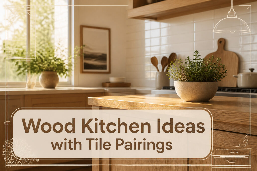
Wood kitchens with tile backsplashes run from rental-grade laminate with geometric porcelain to oil-rubbed raw oak against 24-by-48-inch porcelain slabs, and the gap between those points is wider than most people budget for. The single factor that sorts one idea from another is not the wood species or the tile pattern; it is how much maintenance you will actually perform once the installers leave. Glossy subway tile behind a gas cooktop wipes clean with hot water, but matte tile near the same range holds grease like a chalkboard, and that difference alone will shape your daily routine more than any mood board. A friend in Malibu kept light oak shelving with glossy white tile looking intentional for years because the pairing asked nothing of her beyond a damp cloth.
1. Minimalist Wood and White Tile
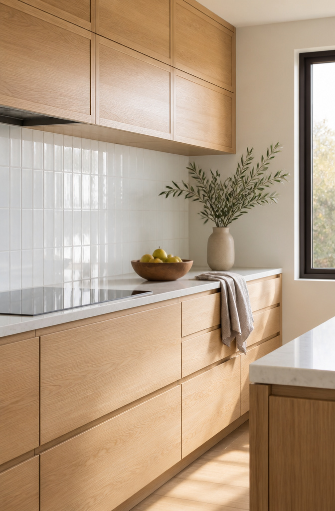
Light oak or ash cabinets keep a small kitchen from closing in on itself, and a white tile backsplash behind them stretches the wall outward visually. The wood brings warmth that all-white kitchens often miss, but without dark grain or heavy hardware the room still reads as open.
Glossy white tiles bounce light around a tight galley or a kitchen that faces north, which is why that finish shows up in so many urban apartments I have looked at. Matte white works better under direct sun or strong LED pendants where gloss would throw glare back into your eyes. Either finish keeps the wood from feeling heavy because the eye keeps traveling to the pale field instead of settling on the cabinets.
For a rental or a first home, glossy subway tile cleans faster and costs less long-term. Grease wipes off the slick surface with plain hot water; matte texture holds oil near the grout line and needs more scrubbing. I have seen light wood shelving paired with glossy white tile hold up for years in a friend’s Malibu kitchen, and the combination still looked intentional rather than dated.
2. Rustic Wood with Patterned Ceramic
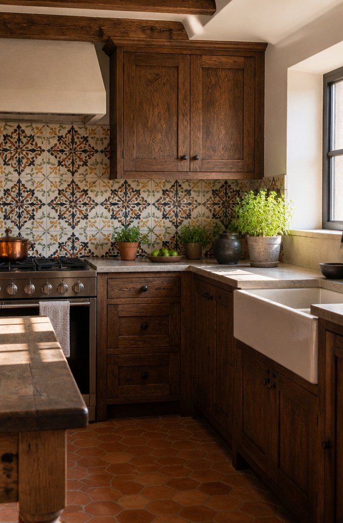
Distressed or reclaimed-look wood cabinets read as costume if the tile starts shouting the same "rustic" message back at them. The pairing works when one element carries the story and the other stays quiet enough to let it.
Small, busy geometric patterns need calmer wood grain. A hand-painted Moroccan tile with a six-inch repeat fights wide, knotty walnut planks for attention and the room ends up looking like a themed restaurant. The same tile against a smoother, lower-contrast reclaimed finish, maybe something with the patina worn soft, gives your eye a place to rest. Wide slats or vertical-grain panels with minimal figuring do this job better than heavily distressed surfaces when the pattern is intricate.
Flip the balance for larger-scale patterns. A bold geometric at twelve inches or more can handle rougher, more characterful wood because the tile’s scale reads as modern and anchors the vintage quality of the cabinets. The wood becomes texture, the tile becomes the statement.
Walnut finishes tend toward formal even when distressed, so they pair more naturally with geometric ceramics than with hand-painted motifs that can feel mismatched in mood. Reclaimed wood or reclaimed-look finishes have enough irregularity to meet either pattern type halfway, which is why they show up in so many of the kitchens that get this right.
3. L-Shaped Wood Layout with Glossy Subway Tile
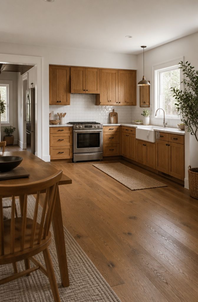
An L-shaped kitchen puts the cooktop on one wall and the sink on the other, with the corner holding the prep space between them. That triangle matters more than the shape itself: you pivot, not run. Wood cabinets on both walls soften the geometry, but without something reflective between them the room can feel like a corridor.
Glossy subway tile behind the range fixes that. The sheen bounces light across the work surface, and the glaze lets you wipe grease with a damp cloth before it sets into grain. Matte tile looks softer in photos, but near a gas cooktop it holds onto splatter like a chalkboard.
I have seen this pairing go wrong when the tile run stops short of the upper cabinets, leaving a stripe of painted wall that discolors within a year. Run the tile to the underside of the uppers and caulk the seam; the extra two feet of material costs little compared to repainting.
Warm-toned wood, something in the oak or ash family, keeps the gloss from reading as clinical. Too gray and the kitchen feels like a lab; too red and the tile starts to look yellow. The middle ground is where you actually want to cook.
4. Scandinavian Light Wood and Neutral Tile
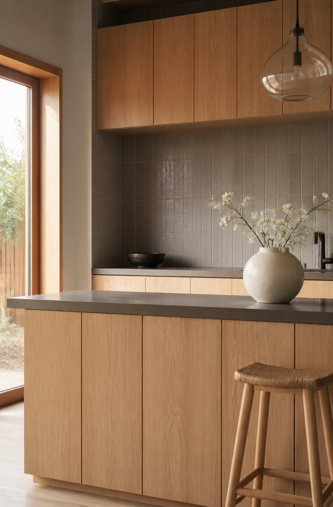
Pale ash or beech reads Scandinavian in a way maple or pine does not. The grain stays quiet, the color shifts cool rather than warm, and the whole cabinet face feels like it grew in that room rather than arriving from a home center. Birch lands closer, though it can yellow over time in a way ash resists.
The tile layer is where this pairing lives or dies. Muted gray, cream, or sand-toned tiles keep the palette restrained, but matte finish is what keeps it from going sterile. Glossy surfaces in a light-wood kitchen bounce too much around an already pale room; matte absorbs the light and lets the wood register as texture instead of competing with reflections.
Hardware finishes need weight to anchor the look. Brushed nickel or black iron pulls do the job better than polished chrome, which reads too showroom against quiet wood. I have seen slab-door ash cabinets with slim matte-gray tile and brass hardware, and the brass alone tipped the whole kitchen toward trend piece rather than settled home. The restraint is the point; the hardware should agree with that.
5. Dark Wood Cabinets with Marble-Effect Tile
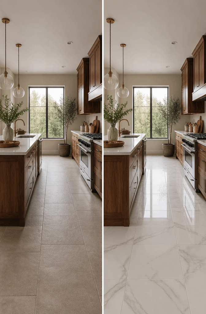
Walnut or espresso-stained cabinetry reads as rich and deliberate, but the pairing only works if you plan for how much light it will swallow. Porcelain tile that mimics Carrara or Calacatta marble brightens the equation without the maintenance headaches; the veining is printed, not geological, and the glaze resists the etching that ruins real marble near a lemon or a tomato. The cost gap is wide enough to matter on a renter budget, and the difference shows only at the edges, where a porcelain cut lacks the crystalline depth of stone. Hold a sample tile at counter height and look down; that angle is where the fakery lives, and it is the angle you will see every morning.
The cave effect is the real risk. Dark wood on three sides of a galley kitchen turns the space into a corridor unless you add light deliberately. Under-cabinet strips, a pendant over the sink, and a warm white bulb around 3000K keep the wood from flattening into shadow. I have seen the same walnut cabinets read as cozy or as oppressive depending entirely on whether someone bothered with the third light source. Budget for two more fixtures than you think you need; the tile will reflect them, but only if they exist to reflect.
6. Maple Island with Textured Wall Tile
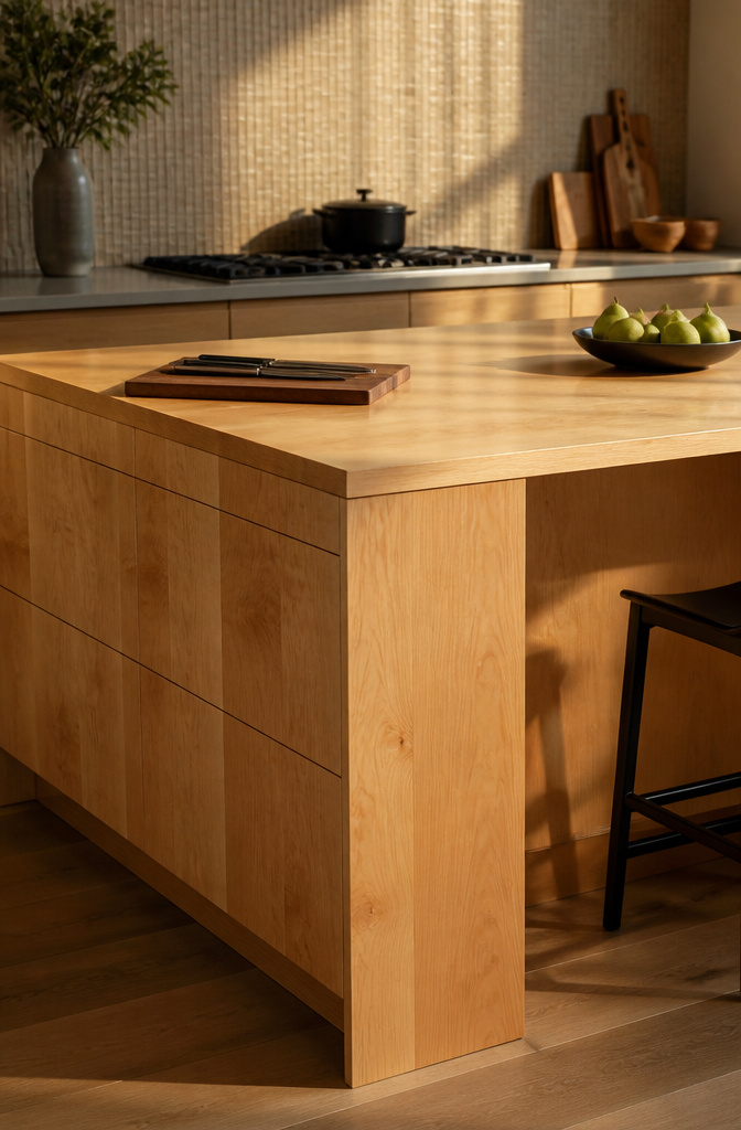
Maple takes a beating better than most woods people reach for first. The grain is tight enough that dropped pans or dragged stools leave dents rather than gouges, and the pale tone hides the small scuffs that darker woods telegraph immediately. On an island, that matters more than on perimeter cabinets you barely brush against.
I kept the perimeter cabinets painted and let the island carry the wood statement. The maple there warms the room without the heavy feeling walnut or cherry can bring to a smaller kitchen.
For the wall behind the cooktop, textured tile catches light in ways flat subway tile never manages. The shadows move across the surface from morning to evening, so the wall reads as slightly different at 7 a.m. than at 6 p.m. Neutral tones in the tile let the maple’s grain stay the thing you notice first. A busy pattern would fight the wood instead of setting it off.
Three-dimensional tile also forgives splatter better than glossy flat surfaces, where every grease mark catches the eye. The texture breaks up the reflection.
7. Wood-Grain Laminate with Geometric Tile
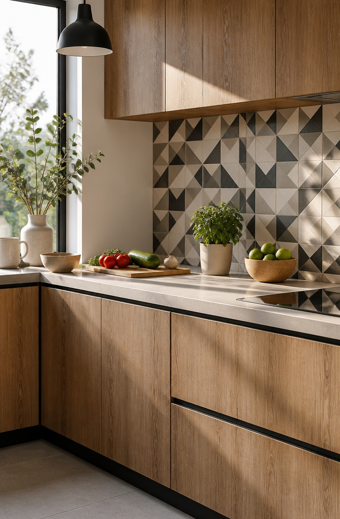
Laminate cabinetry with a convincing wood grain print has come a long way from the orange-toned planks of the 1990s. The better prints now carry enough variation in tone that, from a few feet back, the eye reads them as real veneer. Where laminate still fails is at the edge: any chip or seam swells visibly, and steam from a kettle parked too close will bubble the surface faster than it damages actual wood. For renters or anyone keeping the renovation under a thousand dollars, that trade is usually worth it.
Bold geometric tile against that printed grain works best when the scale is restrained. A 4-inch hex or a narrow picket shape feels current; the large diamonds and busy Moroccan prints that dominated Pinterest around 2018 now read dated. The laminate’s regular grain gives you a steady rhythm, so the tile can carry the visual energy without the two patterns fighting. I would keep the tile to the backsplash or a single accent wall rather than wrapping it around a full shower-adjacent kitchen, where moisture exposure multiplies every weakness laminate already has.
8. Shaker Wood Cabinets with Mosaic Accents
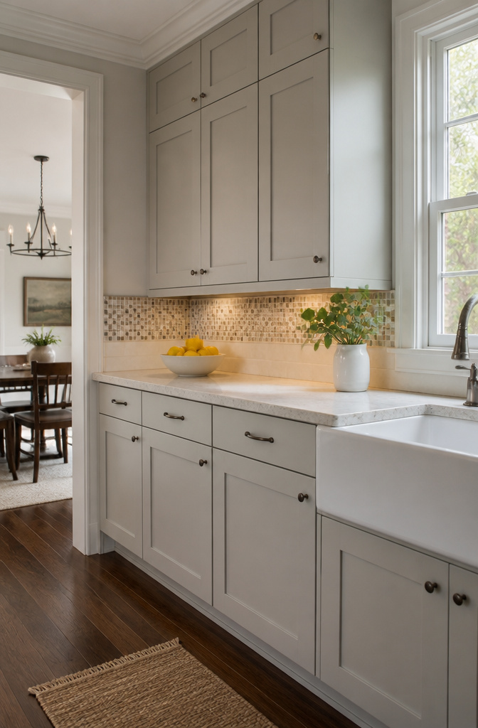
Shaker cabinets carry their own quiet rhythm: the flat center panel, the square frame, nothing extra. That restraint is exactly why a mosaic accent can work, but only if you keep the proportions tight. A mosaic strip four to six inches tall, run as a single horizontal band between upper cabinets and counter, reads as a deliberate detail instead of visual noise. Full-wall mosaic behind a Shaker kitchen fights the simplicity the style is built on.
Matte-finish mosaics in soft brown oak kitchens keep the warmth continuous; the tile recedes and the wood stays central. Glossy or glass mosaic does the opposite, catching light and pulling the eye upward, which can flatten the depth Shaker framing creates. I would not mix both finishes in the same view.
Painted Shaker doors give you more latitude. Ivory or beige mosaics against white or pale gray cabinets stay tonal, so even a slightly wider strip, maybe to the bottom of the uppers, does not break the calm. The grout matters here: matching it to the wood tone, not the tile, lets the mosaic read as texture rather than pattern. Two ways to play this. Keep the mosaic to a single accent strip and let the remaining backsplash be plain field tile, or run the mosaic only behind the range as a focal point. The single strip wins for a small kitchen where every surface is already in view; the range-only patch works when you have enough wall to let the cabinets breathe on either side.
9. Raw Wood Finish with Large-Format Porcelain
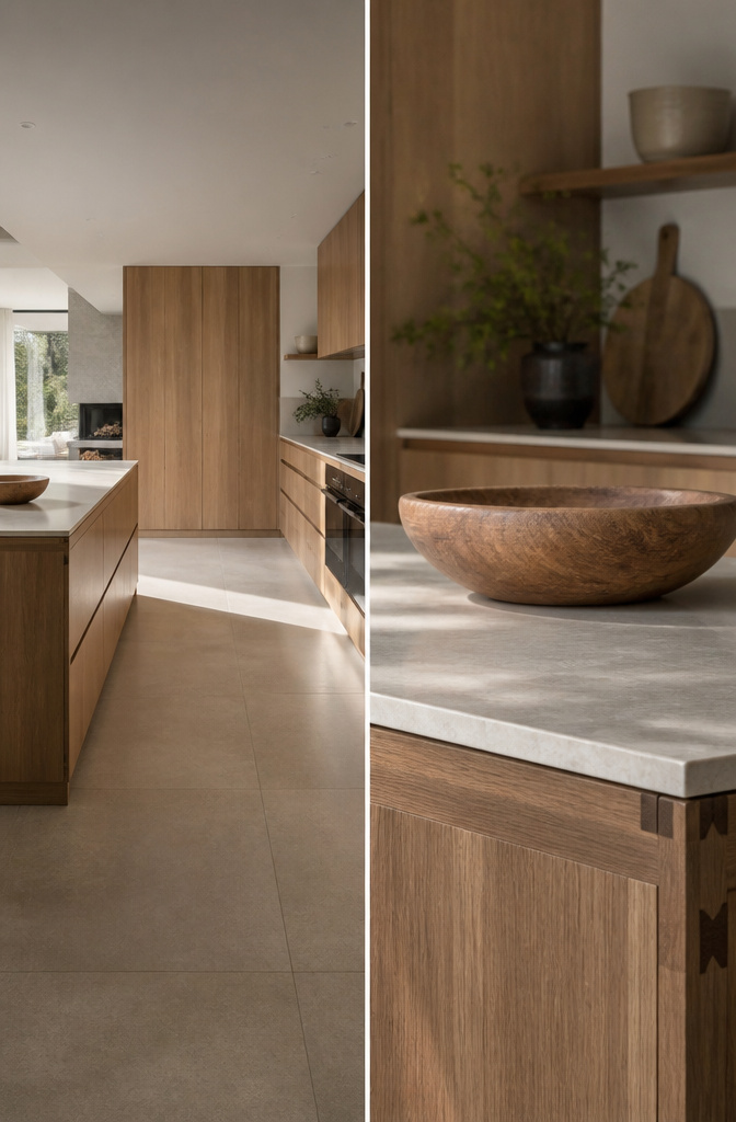
Raw wood finish on kitchen cabinets asks more of you than paint or lacquer, but the warmth it returns is hard to fake. I have spent enough hours reading project logs to know that an oil-rubbed surface needs re-oiling every few months where hands grab, and any splash left standing will darken the grain permanently. The maintenance is rhythmic, not difficult: wipe dry, refresh the oil, learn to live with the patina that gathers. Pair that living surface with large-format porcelain tile, 24 by 48 inches or larger, and the kitchen settles into something visually quiet. The big tile means fewer grout lines breaking the eye’s path, which matters when the wood itself is busy with grain. What the tile needs, though, is a flatter wall than standard subway tile tolerates. Lippage across a joint that wide catches light and reads as sloppiness, so the substrate has to be true or the installation budget climbs fast. The combination works because both materials stay in their lane: the wood moves and ages, the tile stays cool and still, and the room neither shouts nor apologizes.
10. Two-Tone Wood with Terracotta Tile
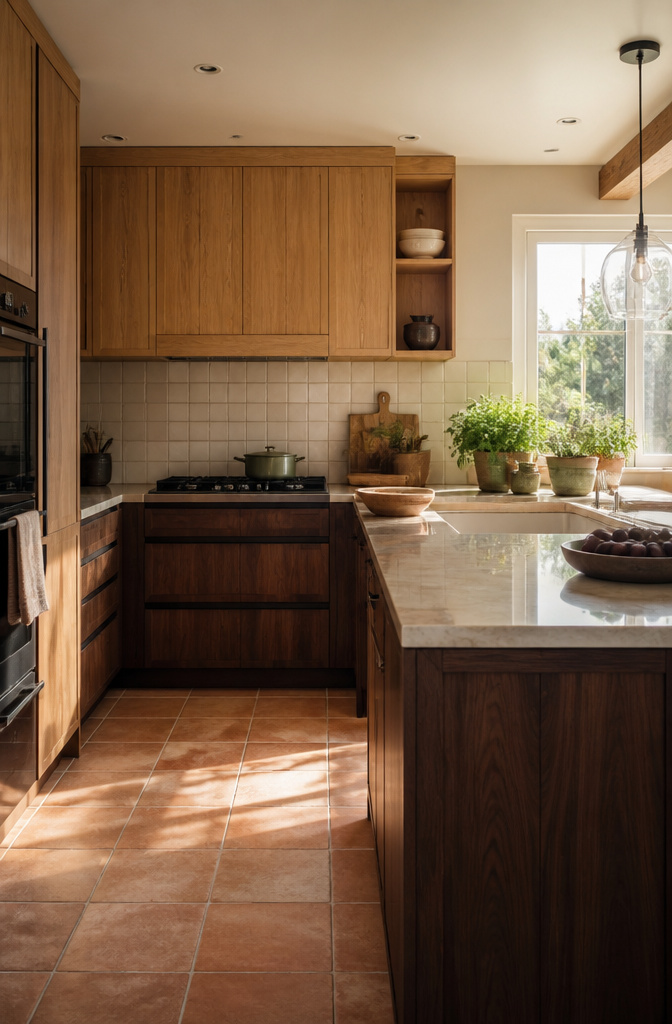
Dark walnut on the lower cabinets and light oak up top keeps the room from feeling top-heavy. The darker tone grounds the space, especially when terracotta tile runs underfoot or up the backsplash wall. That weight distribution matters in a kitchen with standard 8-foot ceilings; flipping the tones leaves the ceiling feeling lower than it is.
Terracotta’s slight size variation and hand-molded surface texture play against the exact lines of built-in cabinetry. The contrast works because the tile carries the imperfection, not the woodwork. In a Toronto remodel that paired natural oak with painted millwork, the designers kept the wood grain to the island and sink area while the range wall stayed smooth. The same logic applies here: let the tile do the organic work and keep the cabinet faces flat and consistent.
Walnut below, oak above also hides the scuffs and water spots that collect at counter height, while the lighter uppers bounce light around the room. The terracotta warms both tones without demanding a third color.
11. Modular Wood Kitchen with Glass Tile Backsplash
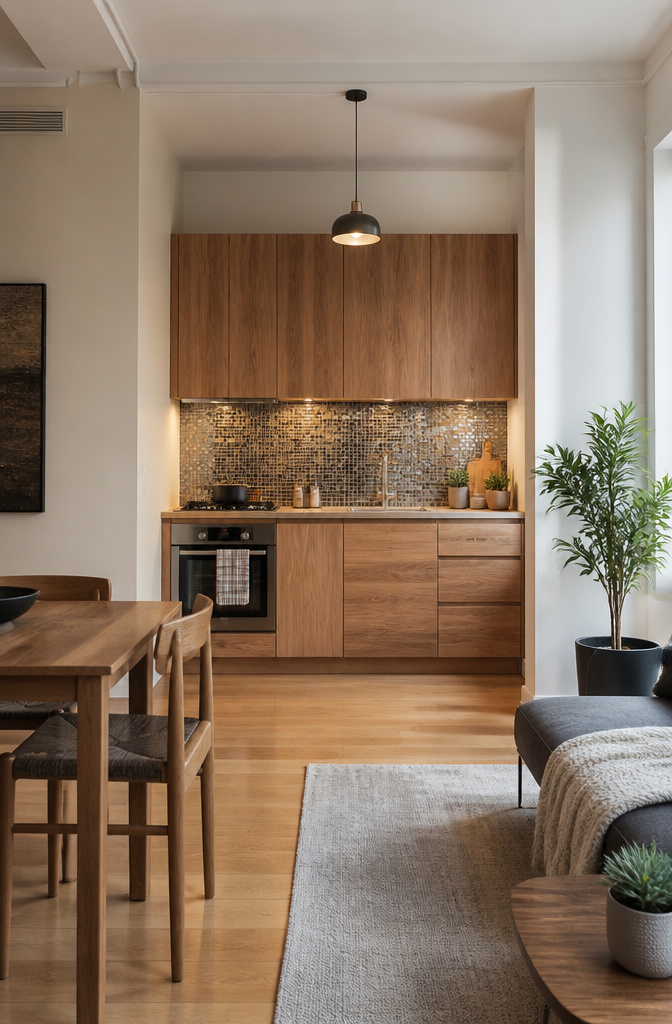
Prefabricated modular cabinet systems with real wood veneer fronts sit in a narrow space between flat-pack laminate and full custom work. IKEA’s SEKTION frames accept Semihandmade or Scherr’s veneer doors, and several online retailers now sell frameless boxes sized to order with walnut or white oak fronts shipped flat. The compromise is in the depth: most modular frames run 24 inches for base cabinets, which leaves tight clearance for a full-size dishwasher or a deep cooktop. You gain a Saturday of installation time because the boxes arrive pre-drilled for hinges and shelf pins, but you lose the ability to shave a cabinet down to fit an out-of-plumb wall.
Behind the counter, glossy glass tile throws light around a compact kitchen better than any painted backsplash. The surface is non-porous, so tomato sauce wipes off without staining, but the grout lines need sealing every year or they darken. Small format glass mosaics, roughly 1 by 1 inch or 3 by 6 inch subway sizes, conform to the slight bows in a modular box wall that large tile would telegraph. Matte grout in a tone close to the wood, like beige against medium oak or warm gray against walnut, keeps the eye moving across the whole run instead of stopping at each joint.
12. Reclaimed Wood with Stone-Look Tile
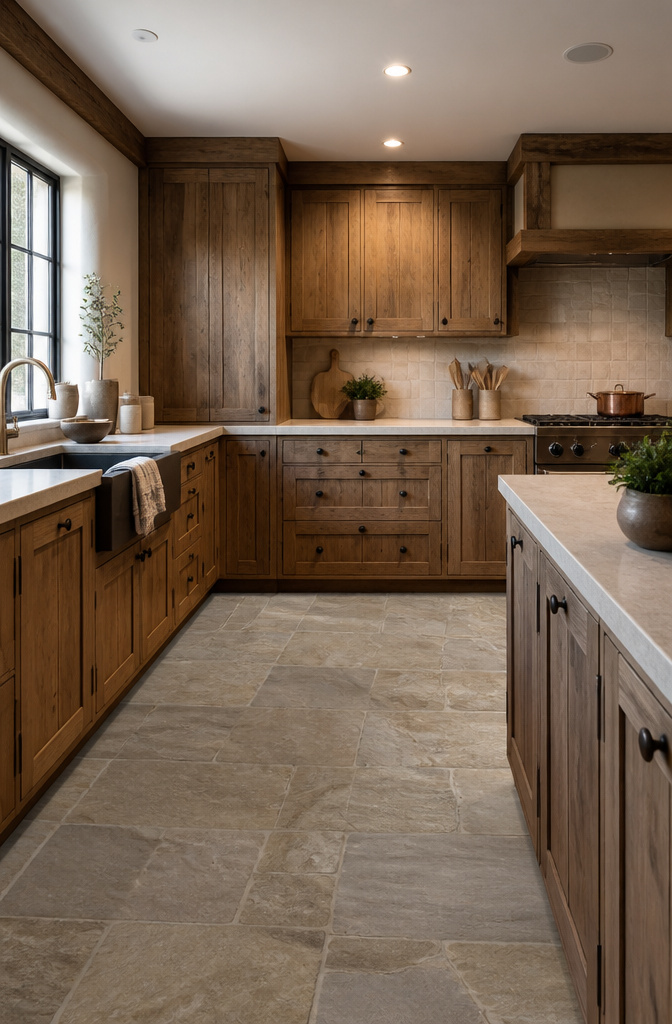
Reclaimed wood brings a warmth that new boards struggle to fake, but not every salvaged plank belongs near a dishwasher. Kitchen-grade reclaimed wood needs to be either old-growth lumber dense enough to resist moisture, or properly kiln-dried after salvage to kill any lingering pests and stabilize the grain. Without that step, a cabinet front can twist once the humidity swings between your summer cooking and winter heating.
FSC certification matters if you are buying new wood with reclaimed character. The label tracks the chain of custody from forest to mill, and for renters or owners who may sell in five years, it is the documentation that actually transfers to the next buyer. Reclaimed wood carries its own story, but FSC-certified new wood gives you the paper trail that some markets now expect.
Stone-look tile outperforms real stone where the kitchen sees real use. Porcelain that mimics slate or travertine does not need the sealing that actual travertine demands every six to twelve months, and a dropped cast-iron pan chips the glaze rather than fracturing a soft stone body. The earthy tones still read as natural, but the maintenance drops to damp-mopping. For a weekend project with a few hundred dollars in materials, that gap in upkeep is the difference between a kitchen you enjoy and one you eventually resent.
13. Wood and White Cabinet Mix
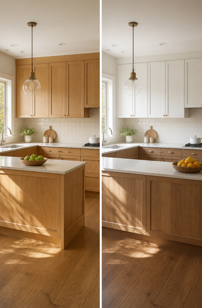
Splitting the cabinet run between wood and white fixes the two kitchens people actually complain about: the cave and the clinic. Base cabinets in a warm natural oak ground the room the way flooring does, while white uppers borrow daylight and push the walls back. Flip the ratio wrong and the effect collapses. The 60/40 rule keeps it weighted: the dominant material gets roughly sixty percent of the visual field, the accent gets forty. In practice that usually means wood bases plus island against white uppers and a stretch of wall cabinets, or a white center island bookended by wood runs.
The white matters as much as the wood. A soft warm white, the kind used on painted millwork in that Toronto kitchen, reads against natural oak without going sterile. Cream instead of stark white saves darker wood from looking muddy; the contrast stays crisp but not clinical. What fails is matching a cold blue-white with red-toned wood, or putting a yellow cream against ash with gray undertones. The floor decides it: pull the wood tone from the flooring, as that designer did with the custom-stained oak, and the two cabinet finishes stop fighting and start talking.
14. Darker Wood Island as Focal Point
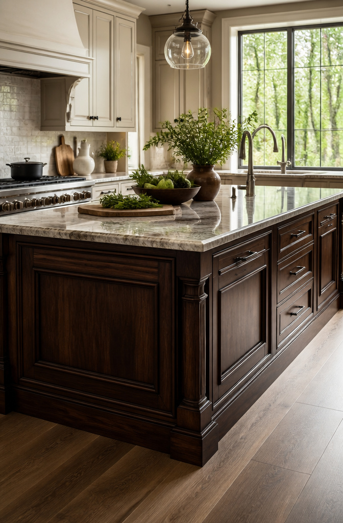
A single dark wood island needs enough mass to read as intentional furniture rather than a leftover block. Six feet of run is the practical minimum for the contrast to register against lighter perimeter cabinets; anything shorter starts looking like a mistake in scale rather than a design choice.
The stain level matters as much as the size. Black-stained oak, like the pieces Matthew Cox builds, sits deep enough to feel grounded without crossing into furniture-show territory. Stone on top keeps the visual weight from tipping entirely downward.
What nobody shows in the photos is the maintenance reality. That same dark finish drinks in water spots and broadcasts every flour dusting and toast crumb across the surface. Morning light hits it at an angle that turns a clean wipe-down into a forensic exercise. If you are the type who wipes the island once after dinner and calls it done, you will be wiping again by breakfast. The freestanding-furniture look is charming until you are chasing streaks with a microfiber cloth three times a day.
15. Wood to Calm a Colorful Kitchen

A kitchen painted in two shades of green with a matching island sounds energetic until you stand in it at 7 a.m. and feel like you have been dropped inside a lime. That is where white oak earns its keep as a neutralizer, not just another warm tone. In the Austin treehouse kitchen that pairing lives in, the oak cabinets run the full wall and ground the green island and door frames without competing against them. The designer stained the oak light to keep the room feeling organic and bright, and that distinction matters: lighter stains read as air and space, while darker stains on the same wood would have turned the cabinets into a second bold voice arguing with the green.
Open shelving in birch or pine does similar work for renters who cannot touch the cabinets. It breaks up a saturated wall color at eye level and gives the eye somewhere to rest that is not painted. The limit is real, though. Wood can soften one or two strong colors; it cannot rescue a kitchen that has gone full rainbow. If the walls, the appliances, and the backsplash are all shouting different colors, adding wood just adds another layer of noise. Wood calms color when it is the largest quiet surface in the room. Once the bold tones take up more visual territory than the wood, the wood becomes trim, not relief.
16. Wood Tones Linking Rooms
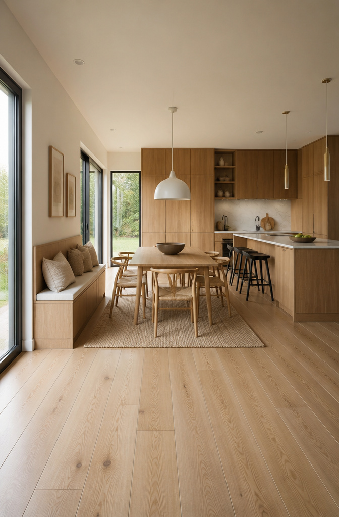
Carrying the same oak tone from kitchen cabinets into a built-in dining bench or living-room shelving sounds straightforward until you hold two sample strips from different manufacturers under the same light. The one labeled "Natural Oak" can read pink beside another that pulls green, and both change under LED versus afternoon sun. What convinced me, reading through a dozen of these projects, is that matching stains across brands works better when you stay within two steps on the same undertone family rather than chasing identical names.
Repetition turns monotonous fast. A single wood tone running through four connected rooms starts to feel like a furniture showroom. The break comes from shifting the material role: cabinets in the kitchen, open shelving in the dining area, then a painted frame with wood-top console in the living room. Same stain, different application, and the eye reads it as rhythm rather than redundancy.
17. Wood Cabinetry in an Open Plan
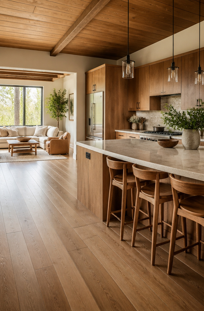
Wood reads softer than paint or metal in an open plan, which matters when the living room sits ten feet from the stove. In a Texas home inspired by the English countryside, the kitchen and living space flow together so completely that a white or metallic kitchen would have felt stark against the seating area. Warm wood tones made the cooking zone feel like an extension of the living room without losing function.
The risk is tone collision. Living room furniture already carries its own wood finishes, and kitchen cabinetry that fights those tones turns the open plan into a furniture store display rather than one room. Match the kitchen wood to the warmest tone already in the living space, or go deliberately lighter and let the difference read as layering rather than mismatch. In that Texas example, the wood cohesion meant the whole room felt considered and lived-in, not like a kitchen crashing a conversation area.
18. Wood Connecting Kitchen to Outdoors
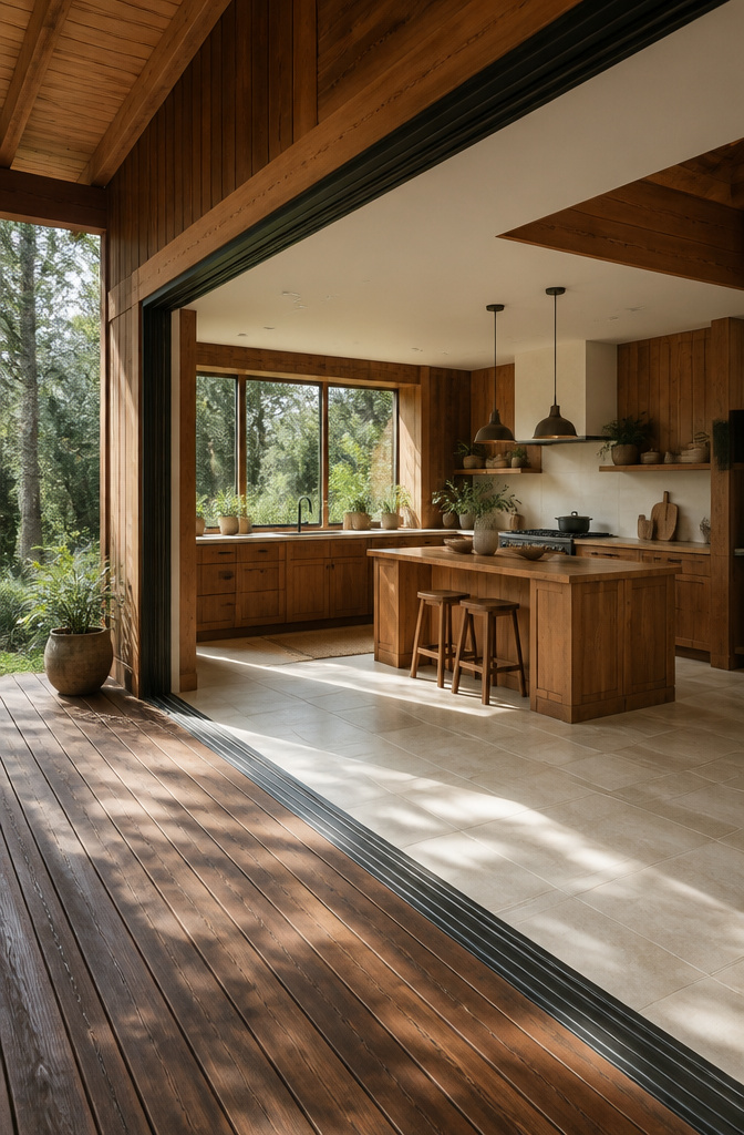
A kitchen with a direct line to the backyard gives wood its best role. The same cedar or redwood that faces your siding can run the island or the range surround, but only if you strip it back and rebuild the finish. Exterior stain breathes and flakes; interior polyurethane or hardwax oil locks out steam and grease without turning the grain plastic-smooth. I learned that distinction the hard way on a friend’s garden-door kitchen, where a year of exterior oil left the cabinet bases black with mildew from the dishwasher vent.
The species that survive outside, cedar and redwood included, are soft. They dent. For a floor or a high-traffic counter, harder white oak takes the same warm tone and holds up to dropped pans. On walls or upper cabinets where hands rarely hit, the softer outdoor echo works fine.
Wood is a perfect choice for adding character and personality to a design scheme—especially when it comes to kitchens.
That character comes from letting the material look like itself, not like furniture. Match the tone to your deck boards, not the exact species, and the kitchen reads as a screened porch that happens to have a stove. The tile pairing stays quiet: a matte cream ceramic with slight color variation picks up the wood’s warmth without competing for attention against the glass. Glossy or patterned tile breaks the illusion; you want the eye to move straight through to the trees.
19. Country Kitchen Wood Features
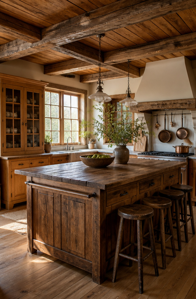
Exposed beams and plank ceilings carry a country kitchen, but the line between character and costume runs thinner than most people think. Becky Shea’s approach of cladding a kitchen entirely in flat-sawn oak with varying stains shows how to stay on the right side: the wood reads as intentional, not theatrical, because the species stays consistent and the stains actually complement each other rather than competing.
Furniture-style cabinet feet hit that same risk. They look collected over generations when the base molding is substantial and the feet are scaled to real furniture proportions; they look like a stage set when they sit too dainty or too high off the floor. The detail that survives daily use is almost always the one that serves a function. A salvaged beam that actually helps carry a modified ceiling layout, or an island built from reclaimed material that takes the knocks of prep work, earns its place in a way that applied trim never quite does.
If the cabinets stay painted or another material entirely, wood still enters through structural elements: beams, a solid island, or open shelving. The warmth comes through without the kitchen becoming a theme. The sustainable-living angle that has driven wood’s return matters less in practice than whether the finish can be touched up after a hot pan scorches the edge or a sink spray leaves water marks. Raw or lightly sealed oak tolerates that reality better than a high-gloss stain that shows every new scratch as a flaw.
20. Slatted Wood Doors
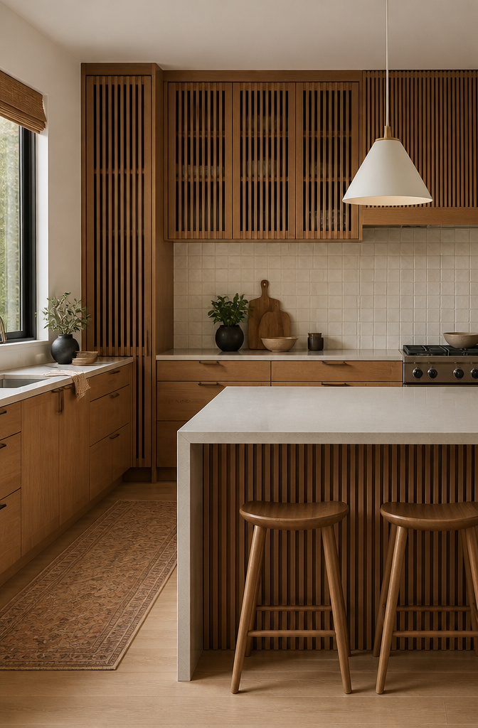
Slatted wood doors on a cabinet or pantry solve two problems solid doors create. Air moves through the gaps, which matters anywhere onions, garlic, or potatoes sit for more than a few days. The wood itself brings in texture without demanding a second material or a bold paint color.
The cleaning reality is what stops most people from pulling the trigger. Dust settles on horizontal slats faster than it does on a flat panel, and grease from a nearby range coats the edges of vertical slats in a way that reads as grime before you notice it. A soft, damp cloth handles the wood; mild detergent and warm water work for any tile surround. The trick is frequency, not force. Wipe spills immediately, and the slats never build up that sticky film that makes the whole kitchen feel neglected.
Keeping the look from reading as garage or locker comes down to proportion and finish. Wide slats with a rough, unfinished grain belong in a workshop. Narrower slats, around the width of a standard subway tile, finished with the same polish you would use on interior cabinets every few months, read as intentional kitchen detail. Pair them with a patinated metal upper or a clean ceramic tile backsplash, and the slats become texture rather than theme.
Frequently Asked Questions
What is the best wood for a kitchen in humid climates?
The article focuses on North American kitchens rather than tropical humidity, but notes that reclaimed wood needs kiln-drying after salvage to stabilize the grain against moisture swings between seasons. For genuinely wet environments, marine plywood or dense old-growth lumber resists warping better than standard hardwoods.
Can I mix different types of wood and tiles in one kitchen design?
Yes, and the 60/40 rule keeps it from looking accidental. Give the dominant material roughly sixty percent of the visual field, the accent forty. Wood bases plus island against white uppers works; flipping the ratio wrong collapses the effect.
How do kitchen tiles enhance the durability of a wooden kitchen?
Tiles act as a protective layer where wood cannot. Behind a range, glossy subway tile lets you wipe grease before it sets into grain. Stone-look porcelain outperforms real stone, resisting chips from dropped pans and eliminating the sealing cycle that actual travertine demands every six to twelve months.
Are wooden kitchens more expensive than acrylic or laminate kitchens?
Solid wood costs more, but the article notes laminate with convincing grain prints now fills a middle ground for renters or sub-thousand-dollar budgets. The trade is at the edges: chips swell visibly and steam bubbles the surface faster than it damages real wood.
How often should I maintain or polish my wooden kitchen cabinets?
Raw oil-rubbed surfaces need re-oiling every few months where hands grab, and any standing splash darkens the grain permanently. For standard lacquered or sealed cabinets, the article does not specify a polish schedule; the maintenance rhythm is wipe dry, refresh the oil, learn to live with the patina that gathers.